Checkout Flow Redesign
For Project Management Institute
The Checkout Flow Redesign streamlined a complex, outdated process by reducing steps, improving visual hierarchy, and enhancing usability across devices. Through research-driven design, collaboration with developers, and a refined UI, the new checkout experience led to a 14% increase in conversion rate, while significantly reducing user friction and technical issues.
Project Overview
My Role
Competitive Analysis – Conducted a competitive analysis of checkout flows to identify best practices.
UX Design – Collaborated with another UX designer during the low-fidelity phase.
UI Design – Designed high-fidelity mockups using a design system to ensure a cohesive digital experience. Deliverables included 60+ mockups (desktop, tablet, mobile) and 5 interactive prototypes.
Developer Handoff & Collaboration – Maintained close collaboration with developers, ensuring designs were feasible and properly prepped for development.
Collaborators
1 additional UX Designer (during lo-fi phase only)
1 Product Owner, 1 Project Manager
Development Team, User Research Team, Analytics Team
The Problem
The existing checkout flow was overly complex and outdated, leading to frustration and high drop-off rates. Users had to navigate too many steps, increasing cognitive load and making the process feel unnecessarily long.
Additionally, the visual design lacked clarity, making it difficult for users to scan and complete their purchase efficiently. Critical information such as order summary, promo codes, vouchers, and primary CTAs were disconnected, further contributing to confusion.
This project aimed to streamline the checkout experience, modernize the design, and improve information hierarchy, ultimately reducing friction, enhancing trust, and increasing successful transactions.
The Approach
Research Takeaways
Insights from User Research, Market/CX Research, and Analytics Data uncovered key pain points:
Too Many Steps & Complexity – Users find the checkout process cumbersome due to excessive steps, ambiguous information, and disconnected workflows.
Unclear Information – A need to simplify the checkout process by providing relevant details at the right moments will enhance ease and satisfaction.
Lack of Clear Cost & Invoice Information – Users struggle with unclear pricing breakdowns and difficulty in locating invoices.
Inconsistent & Confusing Checkout Experience – The current flow contains too many inconsistent sections, making it hard for users to navigate seamlessly.
Site Performance Issues – Technical inefficiencies further contribute to user frustration.
User Experience Audit
Worked alongside another UX designer to conduct a UX audit, referencing multiple research-backed usability principles including:
Heuristic Evaluation – Assessed checkout usability using Jakob Nielsen’s 10 usability heuristics.
eCommerce Best Practices – Leveraged Baymard Institute’s research for checkout optimization.
Competitive Analysis – Reviewed how leading brands structure their checkout experience.
Key Challenges
Complex System & Cross-Team Collaboration: PMI’s checkout flow pulls data from multiple sources, making the design process complex. To ensure feasibility within system limitations, I worked closely with the development team, maintaining weekly check-ins throughout the project. This collaboration helped align technical constraints with design decisions, ensuring a smooth implementation.
Business Complexity & Diverse User Needs: With a complex business model, strict rules, and varied pricing across zones, the checkout experience needed to accommodate a wide range of users at different stages of the process. To maintain clarity and alignment, I created detailed documentation outlining all requirements and edge cases. Additionally, I developed mockups for all possible variations of the checkout page, allowing stakeholders to visualize how different components would appear in various scenarios.
The Solution
Cart Page
The redesigned cart page features a streamlined layout with improved visual hierarchy, clearly separating cart items, order summary, and recommended products. By removing clutter and unnecessary elements, the new design reduces cognitive load, while the more prominent ‘Checkout’ button naturally guides users to the next step.
Before
After
Checkout Page
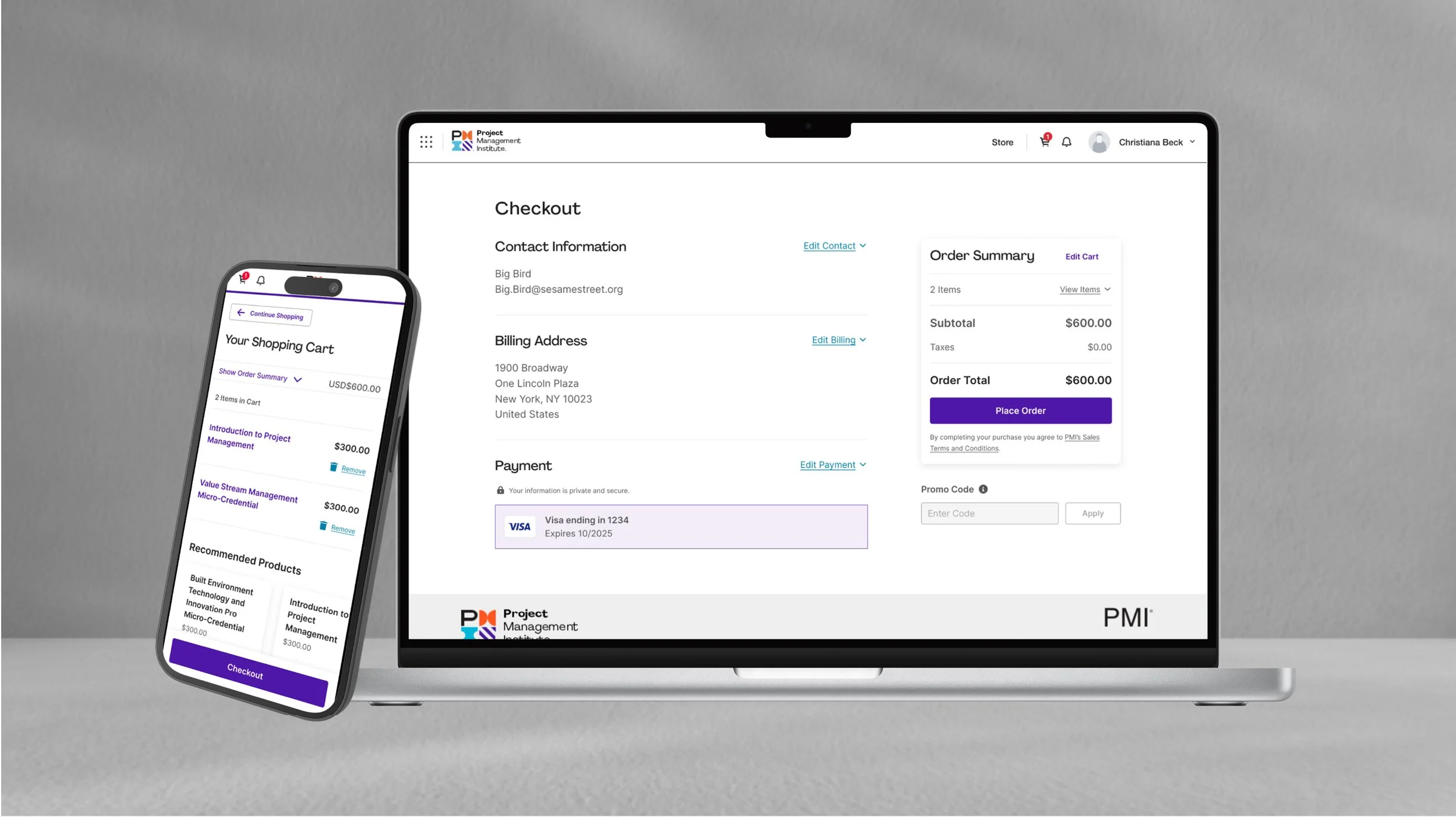
The redesigned Checkout page now features a clear, step-by-step process with purposeful focal points that guide users through each task. Users can now enter information directly on the page, eliminating the need for multiple modals, streamlining the experience, and reducing friction.
Before
After
Order Review
The order review step is now cohesive with the other pages, allowing users to quickly scan the page to double check all information entered before moving forward with their purchase.
Before
After
Mobile Mockups
Priority was given to creating seamless and user-friendly experience on mobile devices.
A sticky primary call-to-action button was implemented that is always present while scrolling through the page on a mobile device.
A sticky order summary module was also added to the mobile view. Users can open and close this accordion module to see their full order summary.
Shopping Cart
Checkout Page
Confirmation Page
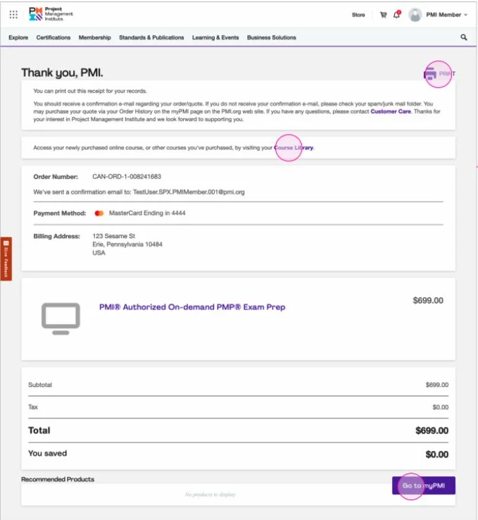
The Confirmation page follows a consistent layout with the other checkout pages. Users can quickly scan the page to see the products they purchased, total cost, and payment method. Research showed that users had difficulty accessing digital products after purchase. In the new design, there is a section for users to access their items and a primary CTA that takes them directly to their newly purchased product.
Before
After
Select Features
Local Currency
The design needed to account for extra characters needed when displaying prices in local currencies, ensuring the design remains user-friendly across regions.
Promo Code
User research indicated that users experienced confusion around the usage of promo codes. The new design approach takes the findings into consideration and ensures that the promo code and its corresponding products are prominently featured resulting in enhanced clarity and a more seamless user experience.
Loading State
User research indicated a high number of won’t load errors from customers. One of the ways we addressed this was to introduce clear loading states.
Impact & Outcomes
Streamlined Checkout Flow - Reduced checkout pages from 5 to 3, minimizing unnecessary steps. Implemented a clean, intuitive design that serves up key information at crucial decision points.
Improved Performance & Speed - Average response time improved from 3.6 to 2.7 seconds – optimizing site performance. Faster load times led to less frustration and higher conversion rates.
Enhanced Mobile Experience - Improved the mobile experience with a sticky CTA button and collapsible order summary, making navigation and order review more seamless for users.
Increased User Trust & Consistency - Unified visual styles, layouts, and interactions across the checkout flow to reinforce credibility.
By The Numbers
14%
Increase in conversion rate
16%
Increase in transactions
4 point
Increase in NPS score
57%
Decrease in web, UI and tech issues
90%
Decrease in “won’t load” customer issues
50%
Decrease in promo code and voucher confusion


